by Narmina Balabeyli
Updated:
5 min
Shopify's blog editor lets you write text and add images, and that is where it stops. There is no product block, so the products you write about stay one tab away from the reader, and most readers never open that tab.
The good news is that embedding products into blog posts is possible and needs no code. The harder question is where those blocks should go, because placement decides whether the post sells or just gets longer. This article answers both.
Can you add products to Shopify blog posts?
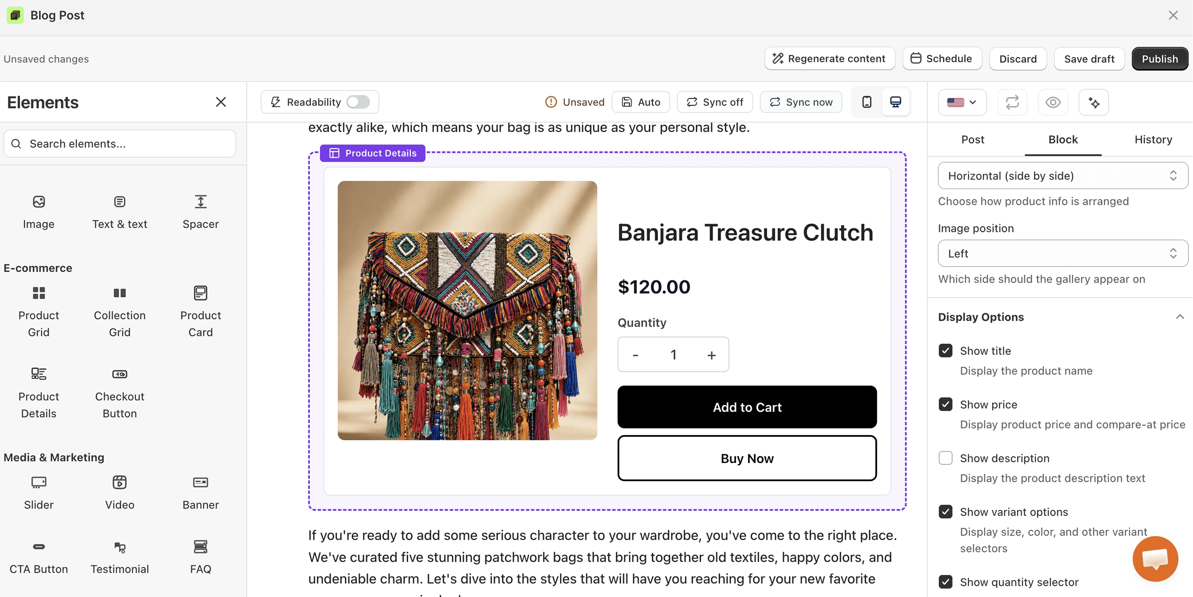
Yes, you can, even though Shopify's native blog editor does not include a product block. Without an app, your options are pasting Buy Button embed code or editing your theme's templates, and both need some technical work. With the vevy.ai Blog Builder, you drag ecommerce elements into the post with no code: a Product Grid, a Collection Grid, a Product Card, a Product Details block, and a Checkout Button. Readers can browse and buy without leaving the article.
Some media and marketing elements and layout elements also carry product or collection links, like the CTA Button, the Banner, and the Text & Product section, so you can sell softly even when a full product block would be too much. The tips below cover when to use which.
12 tips to embed and place products in Shopify blog posts
1. Match the element to the post's intent
A "what is" post and a "best X" post bring readers in very different moods. When the reader is only learning, a soft link or a single CTA button is enough, and when the reader wants recommendations, full Product Grids and Checkout Buttons are exactly what they came for. We explained the four funnel stages in How to sell through blog posts on Shopify, and every tip below builds on that logic.
2. Place the product right after the problem and the solution
When you show the product right where you explain the problem and its solution, the product feels like the next step of the answer, so more readers click it and buy. When the same block sits at a random spot in the post, it reads like an ad, and readers scroll past it.
3. Use a Product Card when the post is about one product
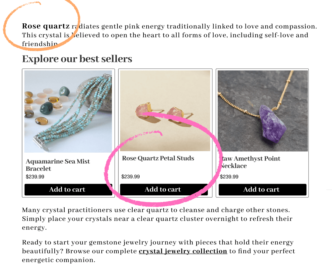
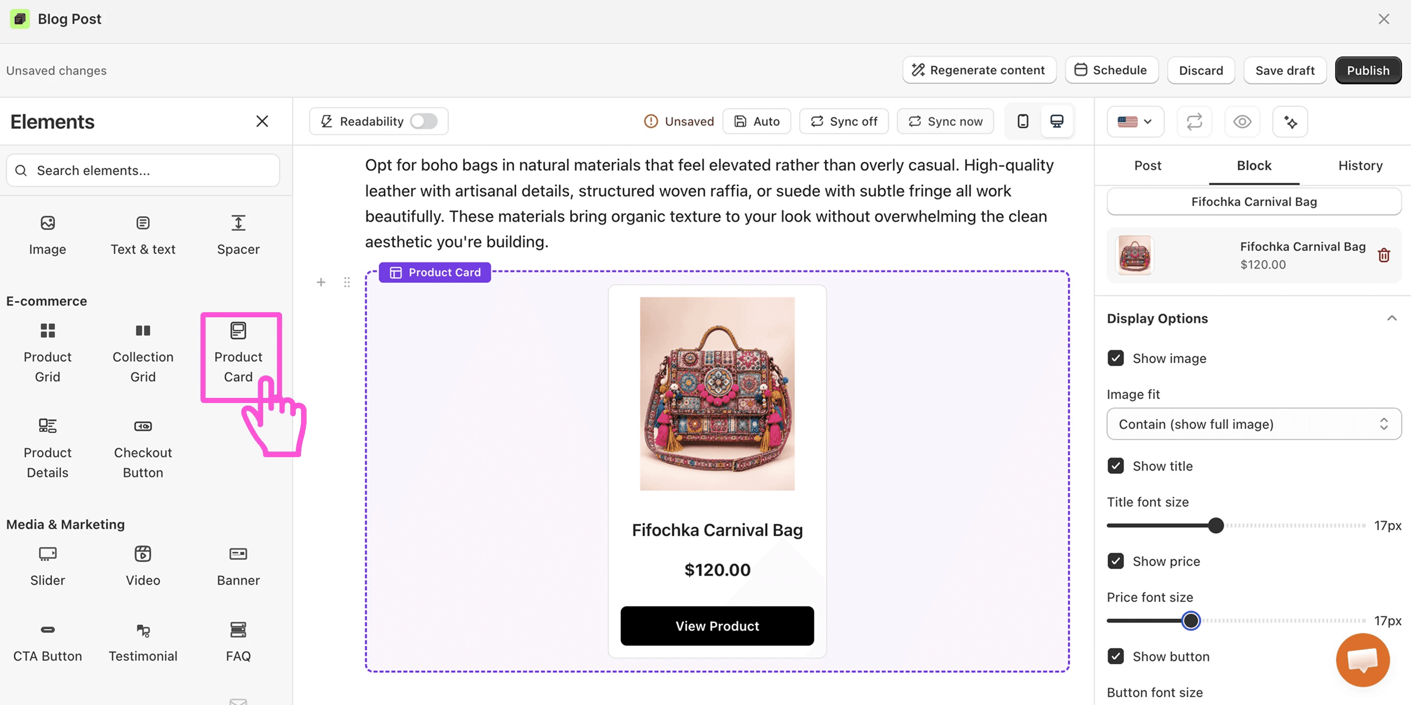
The Product Card shows one item with its image, price, and buy button. Because there is only one choice on the screen, the reader does not compare or hesitate, and the next step stays obvious. It fits reviews, new drops, and any post where one hero product carries the story.
4. Use a Product Details for reviews and deep dives
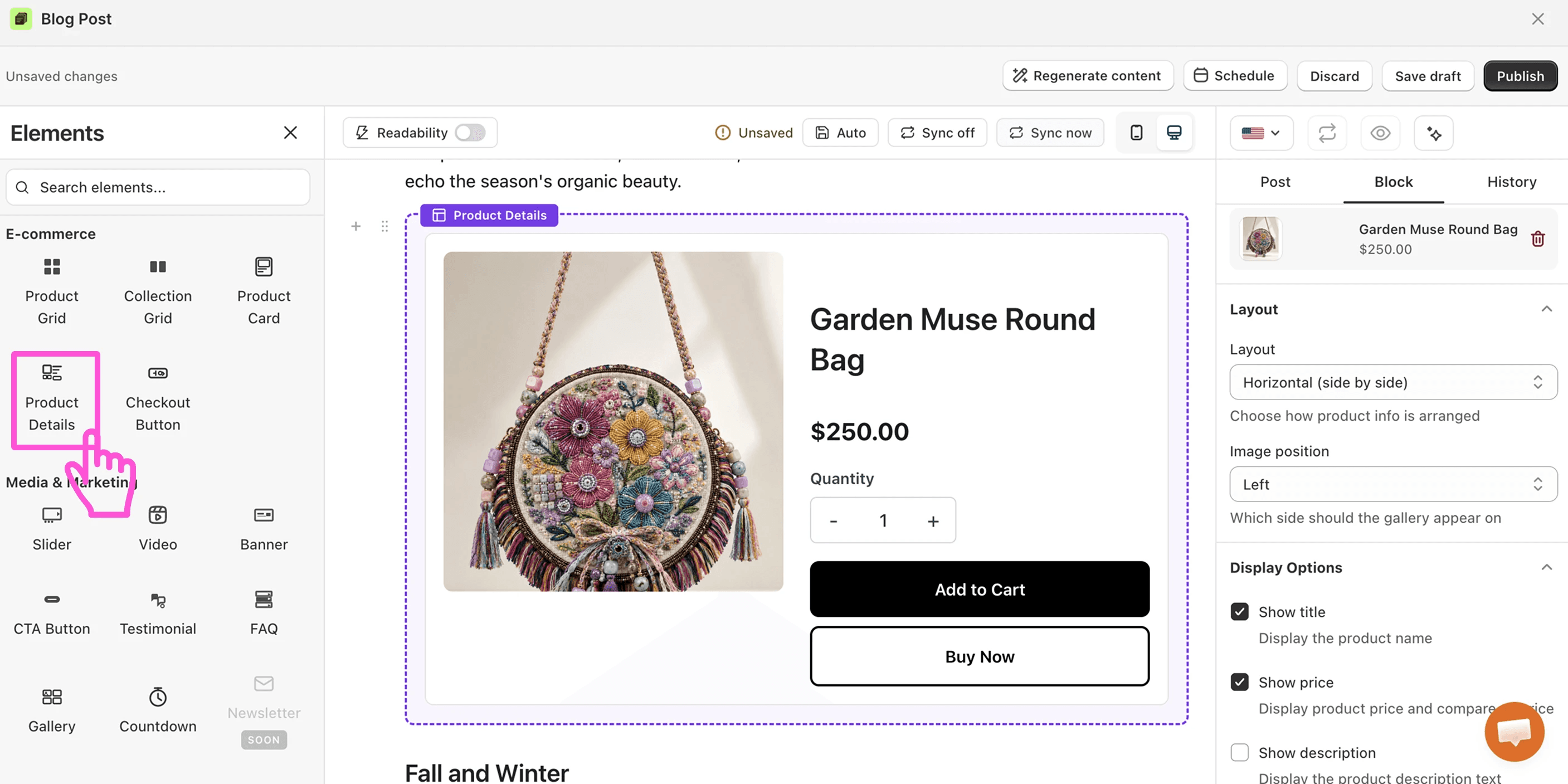
The Product Details block pulls the full description, price, and options into the post. When readers get every answer inside the article, they do not need to open the product page to decide, so fewer of them get lost on the way to checkout. Use it when the whole post is built around one key item.
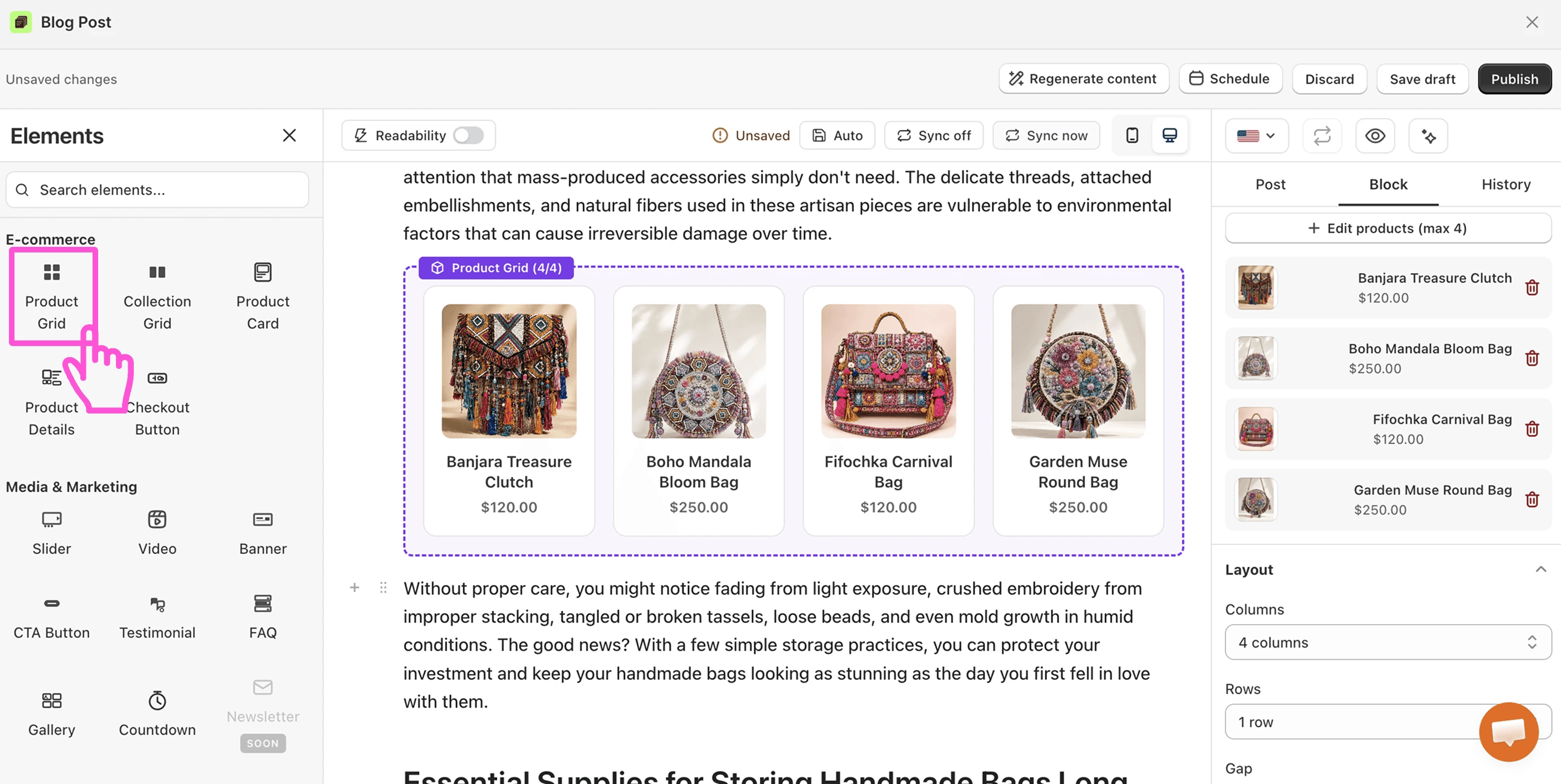
5. Put a Product Grid at the end of roundups and gift guides
The Product Grid works like a small shop inside the article. Place it near the end of a "best X for Y" post or a gift guide, because at that point the reader has read the reasoning and is ready to act. Keep the grid focused on the items the post actually covered.
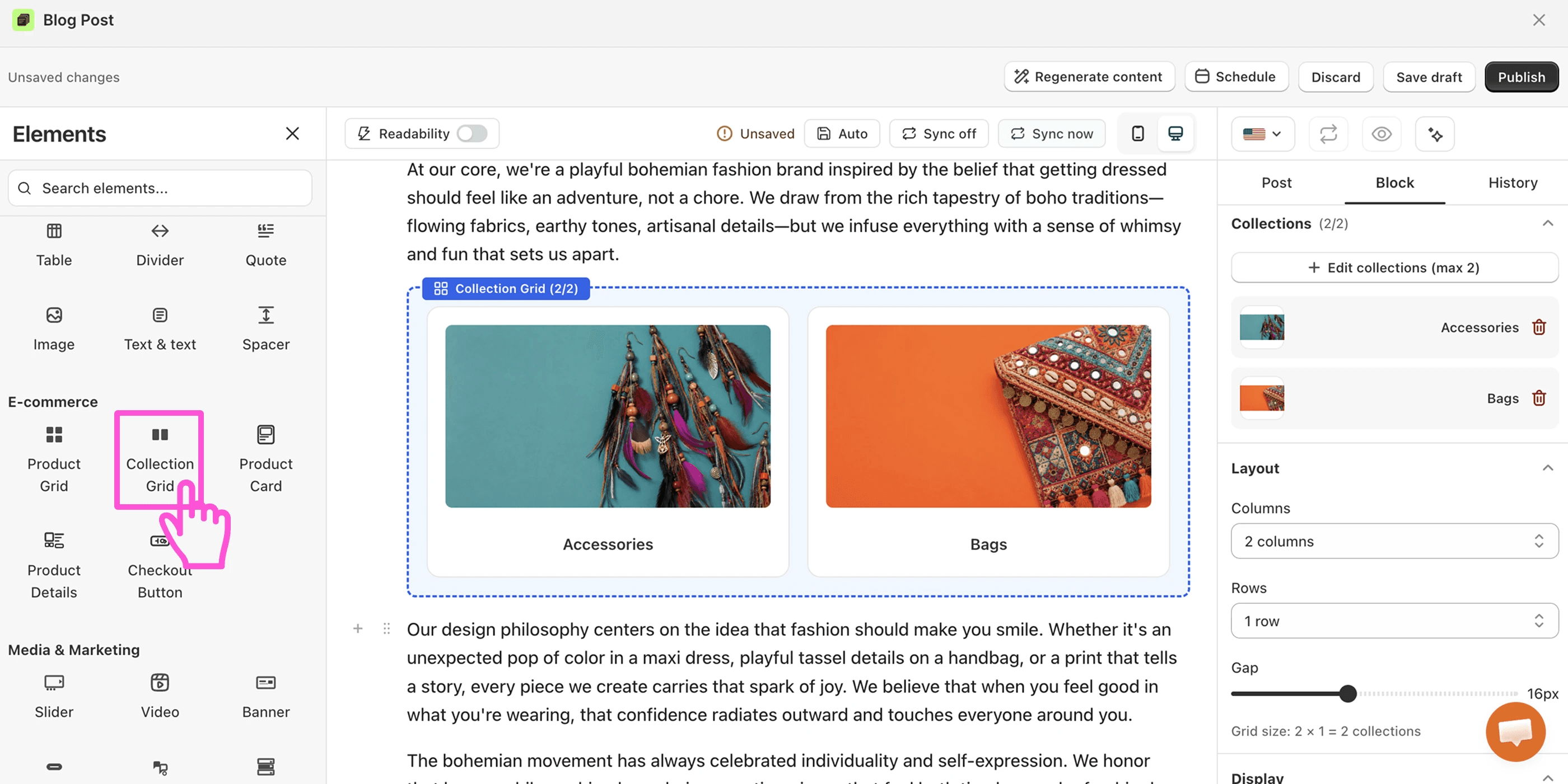
6. Link whole categories with a Collection Grid
When the post covers a broad theme, one product is too narrow. A Collection Grid sends the reader into a full category instead, like a capsule wardrobe post pointing to your whole clothing collection, so one block can lead to dozens of products.
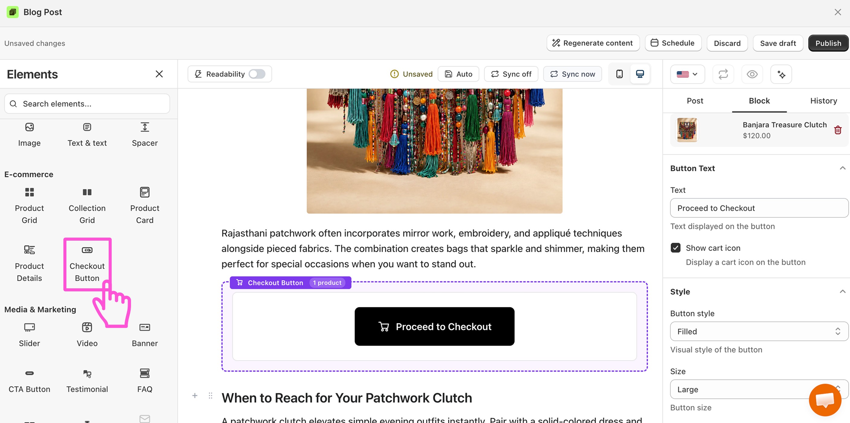
7. Add a Checkout Button only at high-intent moments
The Checkout Button skips the product page and sends the reader straight to payment. That shortcut works after a strong moment, like a glowing testimonial or a limited offer, because the reader has already decided. When you use it too early, it pushes people who are not ready, so keep one per post at most.
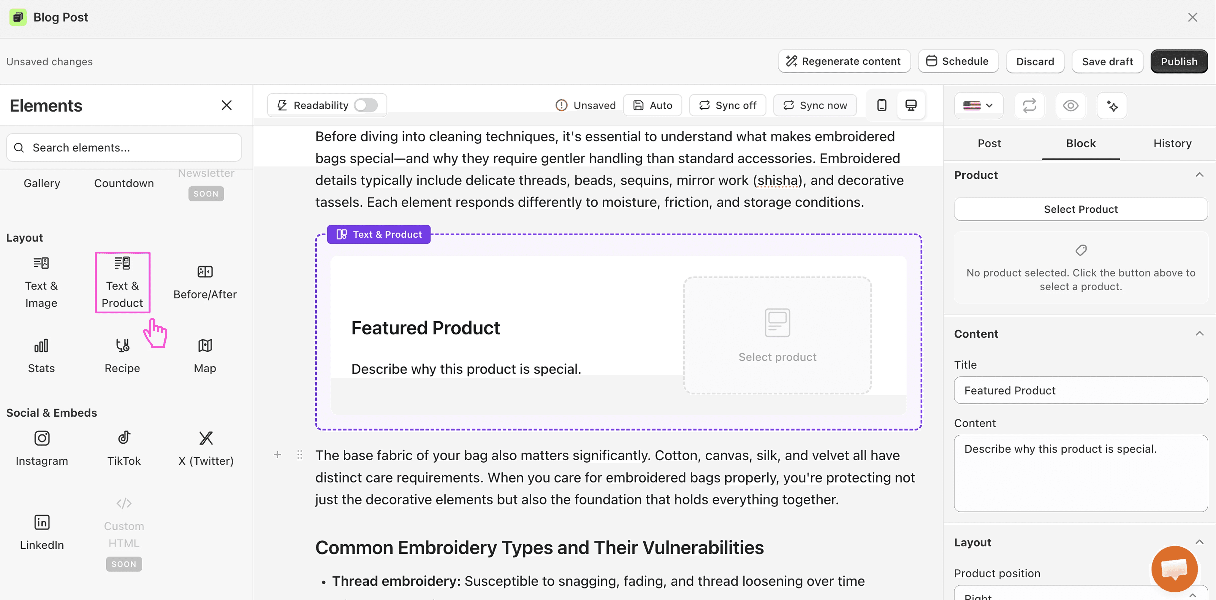
8. Explain and sell side by side with Text & Product
The Text & Product layout puts your writing on one side and a buyable product on the other. When the story and the item sit together, the reader connects them instantly, and a simple tip turns into a small product pitch without breaking the reading flow.
9. Give every product block a context sentence
A bare product card asks the reader to figure out why it is there. One sentence like "this is the one we recommend for small kitchens because it fits under a cabinet" answers that question, so the same card converts better with it than without it.
10. Show proof right before the product
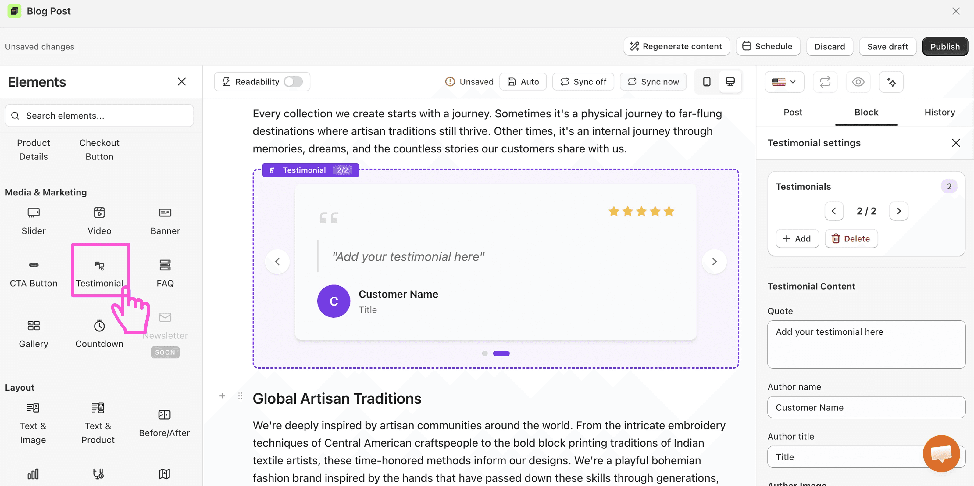
Doubt is highest one moment before the click. When you place a Testimonial or a Before/After block just above the product block, the proof answers the doubt at the exact spot it appears, and clicking feels safe.
11. Use CTA Buttons and Banners for softer product links
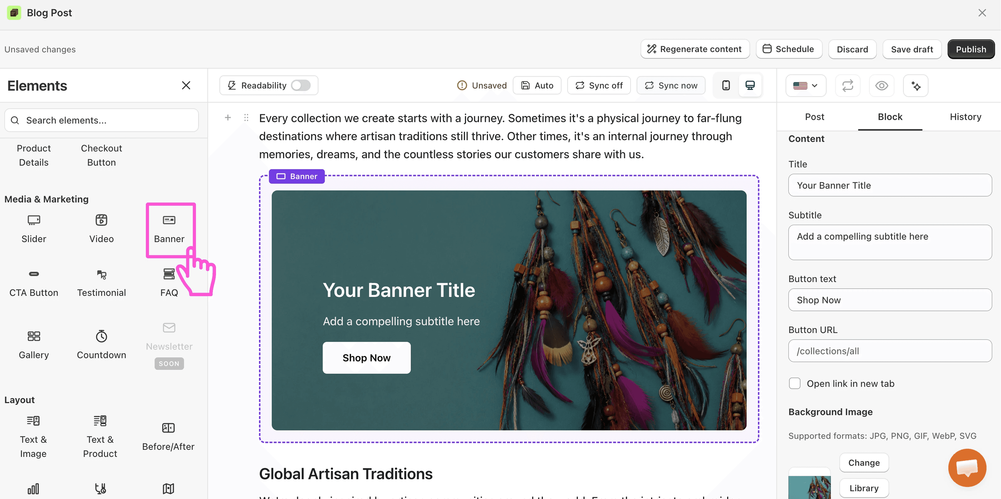
Not every post needs a full product block. A CTA Button or a Banner can link to a product, a collection, or a sale page while staying light, which fits awareness posts where a product grid would feel too pushy. The reader still gets a path to the store, just a quieter one.
12. Keep pure awareness posts almost product-free
When someone searches "what is cold brew", they want the answer, not a shop. In those posts, limit yourself to an internal link or one soft CTA at the end, and let the post hand the reader to a more commercial article. The sale happens later, and the trust you build here is what makes it happen.
The bottom line
Adding products to Shopify blog posts is a solved problem, because the blocks exist and they need no code. The result depends on placement. When each element matches the post's intent and sits right where the reader's interest peaks, the blog starts selling, and when the blocks land randomly, the same post just gets longer. Start with one post, place the product where the answer ends, and watch what your readers do.