
Getting Started

Features

Blog Builder
Blog Builder
/
Basic elements
Basic elements
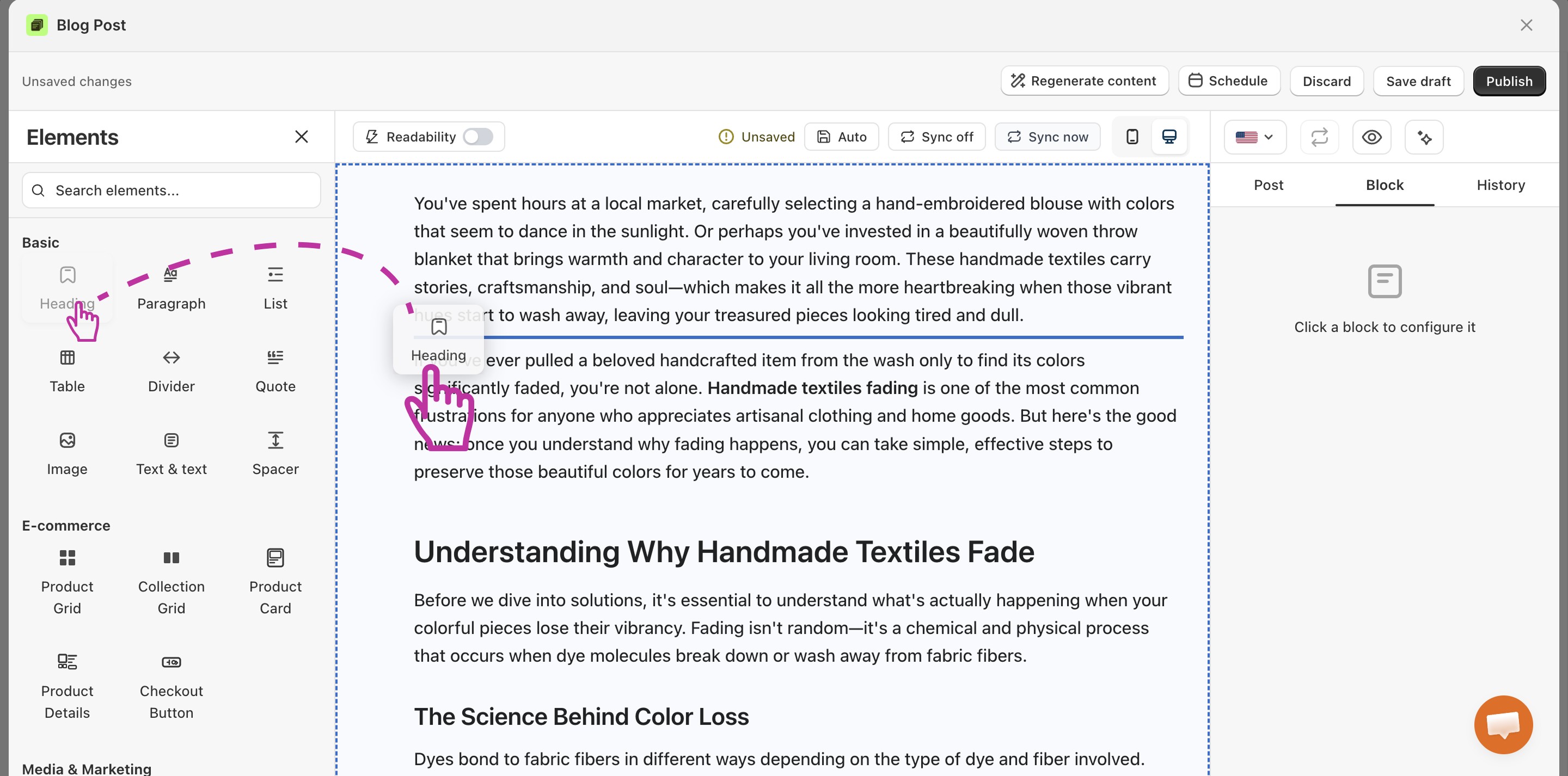
Basic elements are the core blocks you use to build any blog post:
Heading
Paragraph
List
Table
Divider
Quote
Image
Text & text
Spacer
They cover text, structure, images, and spacing, the parts of almost every article. You get all of them free, on every plan. Here is what each section does for your store.
To use any of the element, you just need to drag them from the left menu and drop where you want in the blog post.
Heading
Headings break your post into clear sections, so readers find what they want fast. Most people scan before they read. Good headings keep them on the page instead of clicking away.
Headings also help you rank. Google reads them to understand your post, so your main keywords belong here.
Great for: Splitting a long guide into easy parts, like "How to choose your size" or "Best fabrics for summer."
💡 Pro Tip
Put your main keyword in your top headings. Keep them short and clear, around 5 to 10 words.
Paragraph
A paragraph is a block of standard text. Most of your post is built from these text sections.
Good paragraphs turn readers into buyers. They build trust, answer doubts, and guide people toward your products.
Great for: Sharing product tips, telling your brand story, or walking shoppers through a buying decision.
💡 Pro Tip
Keep each paragraph short, just 3 to 5 sentences. More than half of blog traffic is on phones, and short blocks are easier to read on a small screen. Add links to your product pages where they fit naturally.
List
Lists turn messy info into a clean, easy-to-scan format. Use them for steps, tips, features, or anything with more than two items. Readers love them because they save time.
Lists also help you win the top spot on Google. Search engines often pull list content into featured snippets, which sit above the normal results.
Great for: "5 ways to style this jacket," packing checklists, or step-by-step how-tos.
💡 Pro Tip
Use a numbered list for steps and a bullet list for everything else. Keep each item short and start them the same way.
Table
Tables let you lay out data in neat rows and columns. They help shoppers compare options and decide faster, which means fewer doubts and more sales.
Great for:
Size charts with measurements
Product comparisons, feature by feature
Pricing or shipping options at a glance
💡 Pro Tip
Keep tables under six columns so they look good on phones. Use the first row as your headers. Google can pull table data into search results too.
Divider
A divider is a simple line that splits one section from the next. It gives your post a clean, tidy look and makes long reads feel lighter.
Great for: Marking a clear break before a new topic, a product pick, or a call-to-action.
💡 Pro Tip
Use dividers now and then, not on every gap. Too many makes a post feel choppy.
Quote
The quote block highlights words that matter. Use it to feature a happy customer, a bold claim, or a key fact. It pulls the eye and adds weight to your message.
To add a quote section to your Shopify blog post, drag the quote element from the left menu and drop where you want in the blog post.
Next, you can customize the quote section from the right panel.
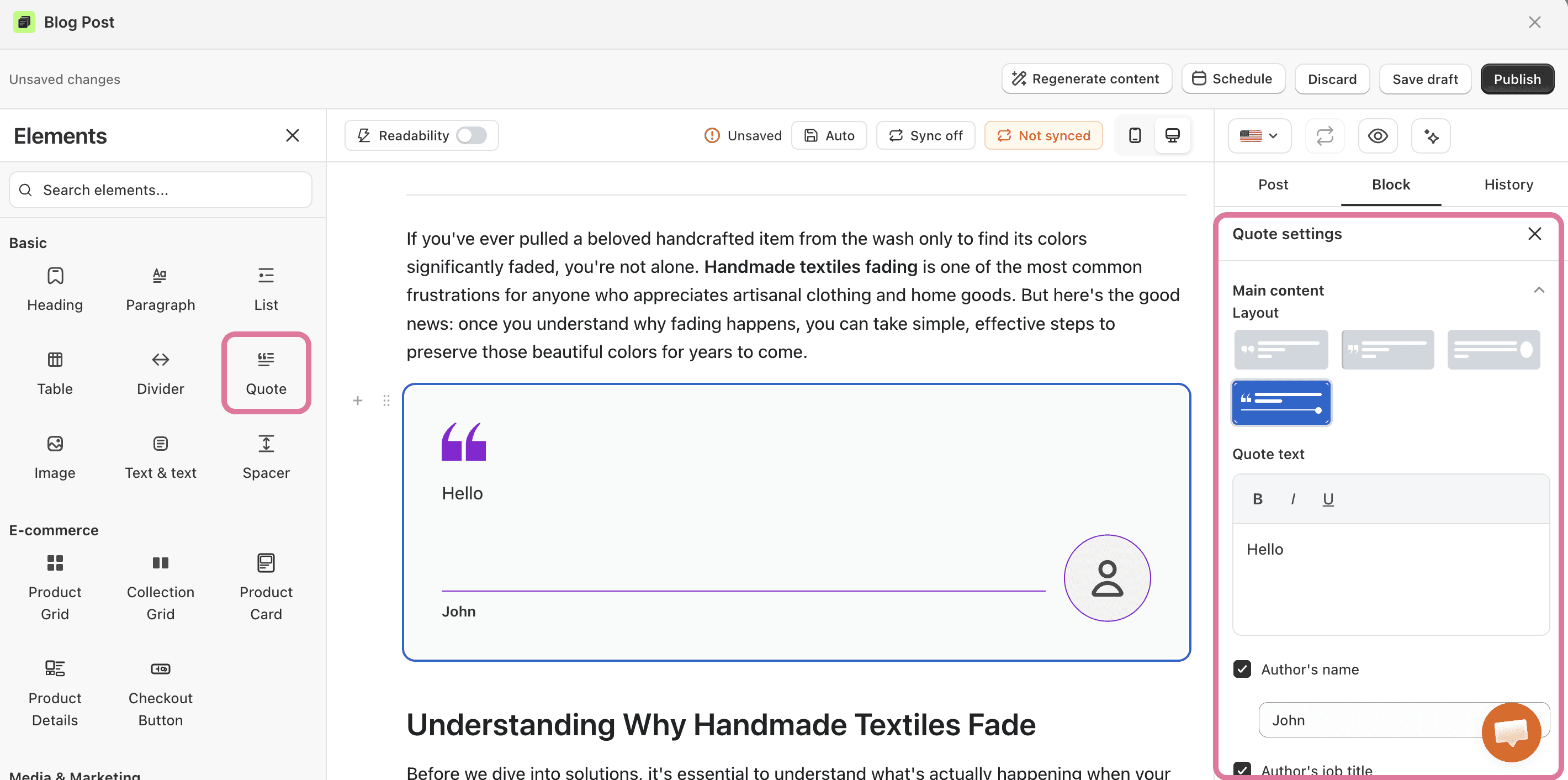
Great for:
Customer reviews: "This serum cleared my skin in two weeks."
A standout stat: "73% of shoppers prefer brands with eco-friendly packaging."
💡 Pro Tip
Always name the person or source. Use just one or two quotes per post so each one lands.
Image
Images show your products in real life. A great photo can sell better than a paragraph, because shoppers want to see what they are buying.
Images also bring in free traffic. Google ranks them in image search, which can send new visitors to your store.
Great for: Product shots, before-and-after looks, or photos that show your item in use.
💡 Pro Tip
Always add alt text that describes the photo, like "mint green organic cotton baby blanket." It helps your SEO and makes your store easier to use for everyone. You can also link an image to a product page, so every photo becomes a chance to sell.
Text & text
This block gives you two text columns side by side. It is perfect when you want to compare two things in a clean, balanced layout.
Great for:
Problem on the left, your solution on the right
Free plan vs. paid plan
Product benefits next to product specs
💡 Pro Tip
Only use it for content that truly pairs up. On phones the columns stack, so make sure each side still makes sense on its own.
Spacer
The spacer adds breathing room between your blocks. A little space makes a post feel calm and easy to read, instead of cramped.
Great for: Adding a clean gap before a banner, a product block, or a new section.
💡 Pro Tip
Use small gaps for minor breaks and bigger gaps for major ones. Don't overdo it, or the post can feel empty.